
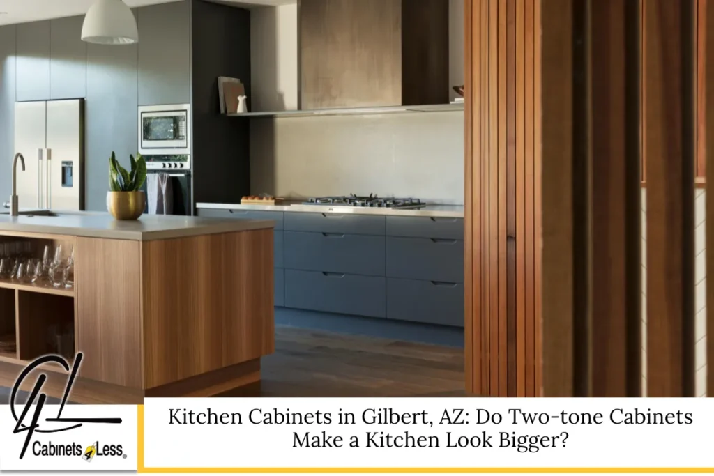
A Fresh Way to Rethink Space and Style in Today’s Kitchens
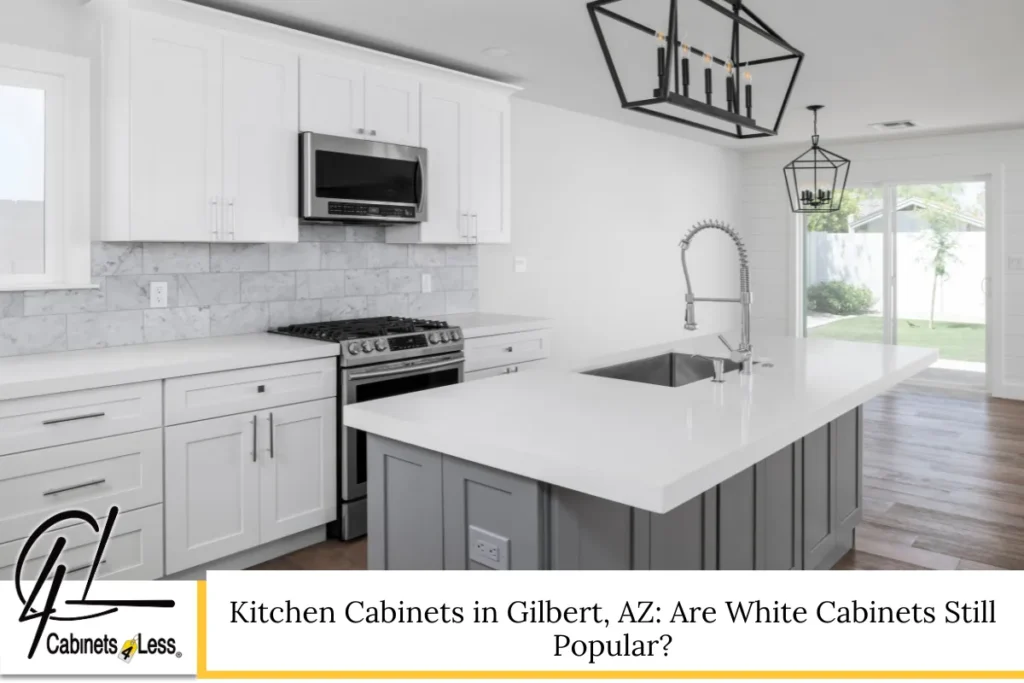
Kitchen Cabinets in Gilbert, AZ often become the focal point when homeowners feel their kitchens look cramped, dark, or dated. The problem is familiar: limited square footage, heavy cabinetry, and poor visual flow can make even well-built kitchens feel smaller than they are. That frustration grows when renovations feel costly or risky, especially if design trends change quickly. Two-tone cabinets offer a practical solution that blends visual expansion with modern style. By using contrast, color balance, and thoughtful placement, this approach can reshape how a kitchen feels without altering its footprint. This article explains how two-tone kitchen cabinets work, why they influence perception, and how to use them effectively to create kitchens that feel open, balanced, and intentionally designed.
Why Kitchen Cabinets Shape How Big a Kitchen Feels
Cabinetry occupies more visual space than almost any other element in kitchens. Walls, counters, and appliances matter, but kitchen cabinets dominate the eye line. The height, color, finish, and layout of a kitchen cabinet system influence how light moves and where the eye rests.
Darker cabinetry tends to absorb light, creating visual weight. Lighter cabinetry reflects light, softening edges and boundaries. When cabinets run wall-to-wall in a single color, especially in smaller kitchens, they can form a solid visual block that emphasizes limitations rather than possibilities.
This is where kitchen cabinetry design goes beyond storage. It becomes a tool for shaping perception. Thoughtful cabinet choices can visually widen a galley layout, raise the ceiling line, or create depth where none physically exists.
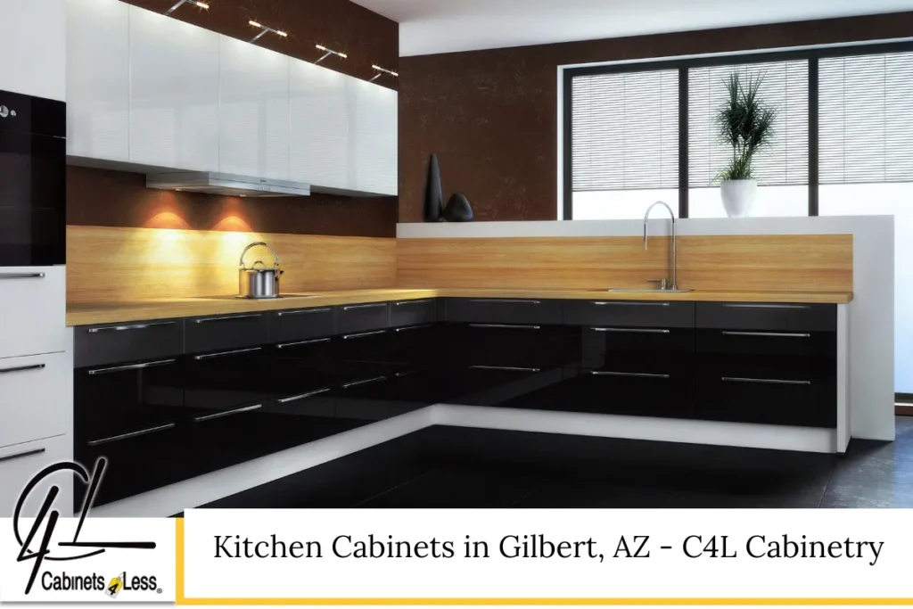
What Two-tone Kitchen Cabinets Really Mean in Modern Design
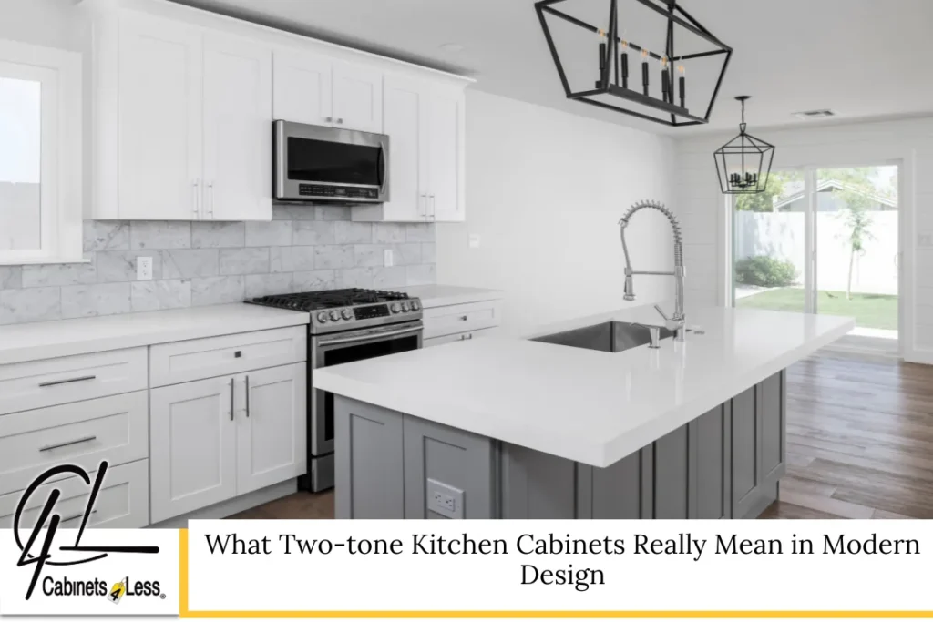
Two-tone cabinets are not simply about choosing two colors at random. The concept refers to using different finishes, shades, or materials in distinct zones of the kitchen cabinet layout. Most commonly, this means one color for upper cabinets and another for base cabinets, but variations go far beyond that.
Designers may use:
- Light upper cabinets paired with darker lowers
- A contrasting island cabinet finish
- Wood tones mixed with painted cabinetry
- Matte finishes combined with subtle sheen
The purpose is contrast with intention. In well-designed kitchens, two-tone cabinetry creates visual layering, which helps the space feel dynamic instead of boxed in.
How Two-tone Cabinets Influence Perceived Space
Visual Weight Distribution Matters
Human vision naturally notices darker elements first. When darker kitchen cabinets sit lower in the room and lighter ones appear above, the eye is drawn upward. This visual lift can make ceilings feel higher and the overall space feel more open.
If all cabinets are dark, especially in kitchens with standard ceiling heights, the room can feel compressed. Two-tone cabinetry breaks that compression by redistributing visual weight.
Light Reflection and Flow
Light-colored upper cabinets reflect both natural and artificial light. This reflection brightens the upper half of the kitchen, reducing shadows and harsh contrasts. When light travels more evenly across surfaces, kitchens appear larger and more inviting.
This effect becomes especially noticeable in kitchens with limited windows or narrow layouts. The strategic use of lighter cabinetry above eye level prevents the space from feeling enclosed.
Depth and Dimension Through Contrast
Using two tones creates depth. Instead of a flat wall of cabinetry, contrast introduces layers. Depth cues are essential for making spaces feel larger. Even subtle differences in shade can create separation between planes, which tricks the eye into perceiving more room.
When Two-tone Kitchen Cabinets Work Best
Small and Medium-sized Kitchens
Two-tone cabinets are particularly effective in compact kitchens. They prevent the cabinetry from overwhelming the space while still allowing for bold design choices. Many homeowners worry that contrast might feel busy, but when done correctly, it actually reduces visual heaviness.
Open-concept Floor Plans
In open kitchens that flow into living or dining areas, two-tone kitchen cabinetry helps define zones without walls. A contrasting island or base cabinet color can anchor the kitchen visually while maintaining openness.
Kitchens With Limited Natural Light
In kitchens where light is scarce, two-tone designs allow homeowners to keep lower cabinets darker for durability and style while using lighter tones above to maximize brightness.
Choosing the Right Color Combinations for a Bigger Look
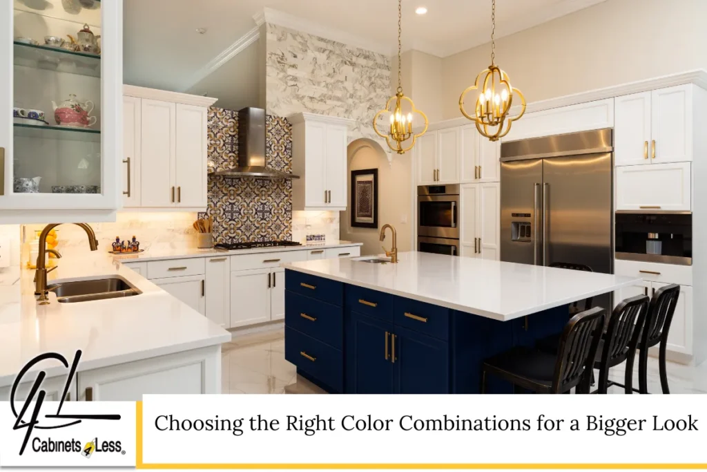
Light Above, Dark Below: A Proven Approach
This is the most popular and effective combination for visually enlarging kitchens. Light upper cabinets blend into walls and ceilings, while darker base cabinets ground the space.
Common approaches include:
- Soft whites or warm neutrals above
- Deep grays, navy tones, or wood finishes below
The contrast adds sophistication without shrinking the room.
Using Wood Tones Strategically
Natural wood finishes introduce warmth and texture. When paired with painted cabinets, wood can soften contrast while still creating separation. Wood works especially well on islands or lower cabinets, adding depth without heaviness.
Avoiding High-contrast Extremes in Small Kitchens
While bold contrasts can be striking, extremely dark and extremely bright combinations may overpower small kitchens. Subtle contrast often delivers better results when the goal is spatial expansion rather than dramatic impact.
Cabinet Layout Choices That Enhance the Two-tone Effect
Upper Cabinets vs. Open Shelving
Replacing some upper cabinets with open shelving can further enhance openness. When paired with two-tone base cabinets, shelving allows light to pass through and reduces visual clutter.
This approach works best when storage needs are balanced with display and organization.
Full-height Cabinets and Ceiling Perception
Full-height cabinets can make kitchens feel taller when done correctly. Using a lighter tone for tall upper cabinets minimizes their bulk and draws attention upward instead of outward.
Island-focused Contrast
In kitchens with islands, using a different cabinet finish for the island adds depth without affecting wall cabinetry. This technique preserves openness while adding a focal point.
Read Kitchen Cabinets in Gilbert, AZ: Are White Cabinets Still Popular?
Finishes, Textures, and Hardware That Support a Larger Feel
Matte vs. Glossy Surfaces
Glossy finishes reflect more light, which can enhance brightness and perceived size. Matte finishes, while popular, absorb more light. Combining finishes carefully can balance style and function.
For example, a subtle sheen on upper cabinets paired with matte base cabinets can increase light reflection without looking overly shiny.
Minimalist Hardware Choices
Oversized or ornate hardware can clutter visual lines. Sleek, simple pulls and handles keep the focus on cabinetry form rather than decoration. This supports a cleaner, more spacious look.
Consistent Countertop and Backsplash Transitions
Continuity matters. When countertops and backsplashes flow smoothly into cabinetry without abrupt breaks, kitchens appear more expansive. Busy patterns or harsh contrasts can interrupt visual flow.
Common Mistakes That Make Two-tone Kitchens Feel Smaller
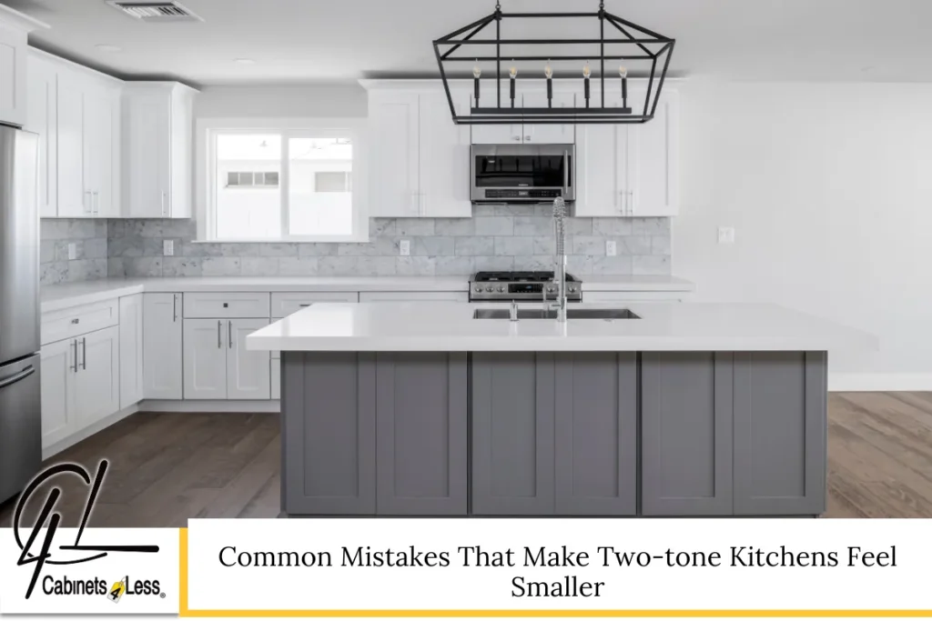
Ignoring Lighting Conditions
Color choices should always account for lighting. A color that looks light in a showroom may appear darker at home. Without proper lighting, even light upper cabinets may fail to brighten the space.
Overusing Contrast
Too many contrasting elements compete for attention. Two-tone cabinets should be the primary contrast, not one of many. Flooring, countertops, and walls should support, not fight, the cabinetry.
Inconsistent Design Logic
Random placement of colors can confuse the eye. Consistency in where tones are applied is essential. When the pattern feels intentional, the space feels cohesive and larger.
How Kitchen Cabinet Design Trends Are Shifting
Two-tone cabinetry continues to evolve. Current design trends favor softer contrasts, natural textures, and timeless palettes over stark color splits. Homeowners increasingly seek kitchens that feel open but still personalized.
Rather than chasing trends, focusing on balance, proportion, and light remains the most reliable way to create kitchens that age well and feel spacious.
Why Customization Matters More Than Ever
Every kitchen has unique dimensions, lighting, and usage patterns. What works in one home may not translate directly to another. Kitchen cabinetry choices should respond to ceiling height, window placement, and daily routines.
Customization allows two-tone cabinets to be tailored precisely, ensuring that contrast enhances rather than overwhelms the space. Thoughtful planning transforms a design idea into a functional reality.
Rethinking Kitchen Space Without Structural Changes
Two-tone cabinets prove that making a kitchen feel bigger does not require tearing down walls. Visual strategies often deliver the most impactful results with less disruption.
By understanding how the eye perceives color, height, and depth, homeowners can make informed decisions that improve both aesthetics and comfort. Kitchens become easier to navigate, brighter to live in, and more enjoyable to gather in.
Kitchen Cabinets in Gilbert, AZ – C4L Cabinetry
We help homeowners rethink kitchen cabinets with clarity and confidence. At C4L Cabinetry in Gilbert, Arizona, we focus on smart design choices that improve how kitchens look and feel, including two-tone cabinet solutions that enhance space and flow. Our team guides you through materials, finishes, and layouts so your kitchen cabinetry fits your home and lifestyle. While we do not handle installation, we can refer you to reputable contractors we trust. If you are exploring new kitchen cabinets and want expert insight without pressure, we are here to help. Call us at (480) 892-5126 or visit our contact form to start planning a kitchen that feels open, balanced, and thoughtfully designed.
Frequently Asked Questions
Can two-tone cabinets affect home resale value?
Two-tone cabinets can positively influence resale value when executed with timeless colors and quality materials. Buyers often appreciate kitchens that feel bright and thoughtfully designed. Neutral contrasts tend to appeal to broader audiences, while overly bold choices may limit appeal. The key is balance and cohesion with the rest of the home. When cabinetry feels intentional and well-integrated, it often enhances perceived value rather than detracting from it.
Are two-tone cabinets harder to maintain than single-color cabinets?
Maintenance depends more on material and finish than color. Lighter upper cabinets may show grease or dust more easily, while darker base cabinets can hide wear. Choosing durable finishes and easy-to-clean surfaces minimizes upkeep. Regular cleaning routines keep both tones looking consistent. Two-tone kitchens are not inherently harder to maintain when materials are selected wisely.
Do two-tone cabinets work in traditional kitchen designs?
Yes, two-tone cabinetry can complement traditional kitchens when colors and finishes are chosen carefully. Soft neutrals, classic wood tones, and subtle contrast preserve traditional character while adding visual interest. The design should respect architectural details and avoid overly modern finishes. When done thoughtfully, two-tone cabinets enhance tradition rather than disrupt it.
How do two-tone cabinets interact with small kitchen appliances?
Appliance finishes should support cabinetry contrast rather than compete with it. Neutral appliance colors integrate smoothly with two-tone designs. Built-in or panel-ready appliances further reduce visual clutter, helping the kitchen feel larger. When appliances blend into cabinetry, the two-tone effect becomes more refined and cohesive.
Is professional design help necessary for two-tone cabinets?
While not mandatory, professional guidance helps avoid costly mistakes. Designers understand proportion, lighting, and material interaction. Even a brief consultation can clarify which tones will enhance space and which may overwhelm it. Thoughtful planning ensures the two-tone concept achieves its intended effect without trial-and-error.
Disclaimer: This article is for informational purposes only and does not constitute design, construction, or installation advice. Design outcomes may vary based on space, lighting, and materials. Always consult qualified professionals for project-specific guidance.
Read What is the Standard Size of Bathroom Cabinets in Gilbert, AZ?